SJSU University Art Collection
Branding
Web Design
3D Build
Software
- Adobe Illustrator
- Adobe InDesign
- Adobe Photoshop
- Adobe XD
Deliverables
- Brand Identity
- Website (Desktop & Mobile)
- Gift Item
- Process Book
Timeline
- March–April 2021
Collaborators
Objective
The Natalie and James Thompson Gallery at San José State University is creating a website called “University Art Collection” which holds digital archives of all their artworks. My team and I had to create a brand, a prototype website for mobile and desktop, and design a physical product that can be sold at the gallery.
Abstract
As a team, we had to choose the color scheme, design the logo and motifs, design and create working prototypes of the website for both desktop and mobile, and design a physical product.
Branding
Hidden
01.
Color Scheme
We chose rainbow but soft colors because they represent the wide range of artworks being displayed.
Primary Colors
PANTONE 184 U
#ff6d81
#ff6d81
PANTONE 134 U
#ffd378
#ffd378
PANTONE 304 U
#8cdbed
#8cdbed
CMYK: 32, 16, 0, 92
#212836
#212836
Secondary Colors
PANTONE 265 U
#9D7AD2
#9D7AD2
PANTONE 1575 U
#ff9664
#ff9664
PANTONE 373 U
#b5e873
#b5e873
02.
Typography
Our main font is called IvyMode, which includes a fleuron—a glyph used as a punctuation mark or as an ornament for typographic compositions. The ornament in this font is used as a motif for the brand. Acumin Pro is used as a contrasting typeface to help with legibility and sensitivity in body text.
03.
Motifs
Our graphical element is diamond shape to show that the artworks are like hidden gems. Our texturing is a gradient of colors with this paint-like effect because many of the artworks were paintings.
04.
Logo
The logo is meant to have a unified feel. The arc across the three letters was inspired by the rainbow to represent the wide range of artists, artworks, and mediums.
Logo Exploration
Final Logo
Archive Website
Hidden
05.
Site Architecture
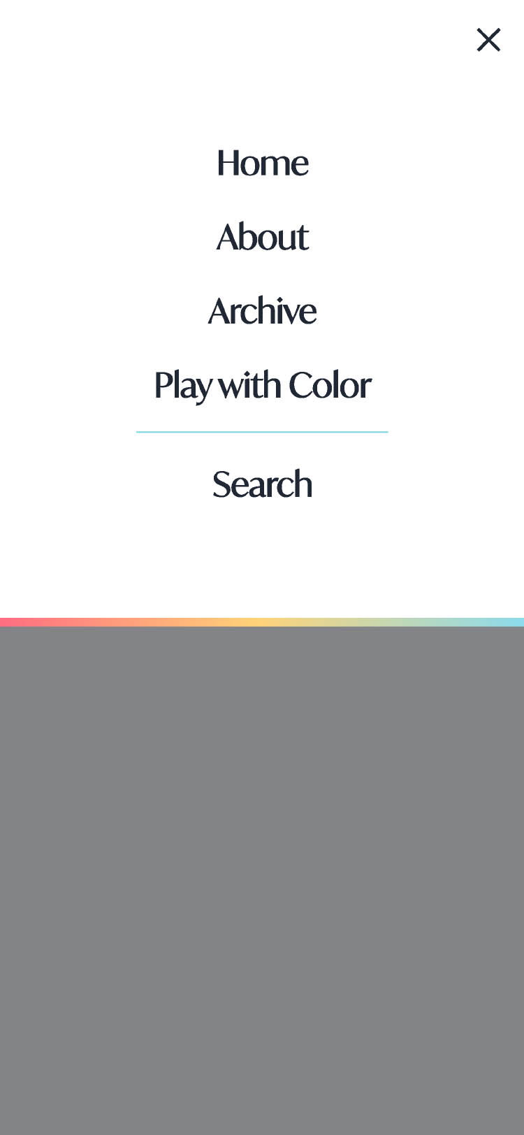
The mobile and desktop versions will include the same site architecture with the same interactions, except the mobile version has an additional menu page.
06.
Desktop Screens
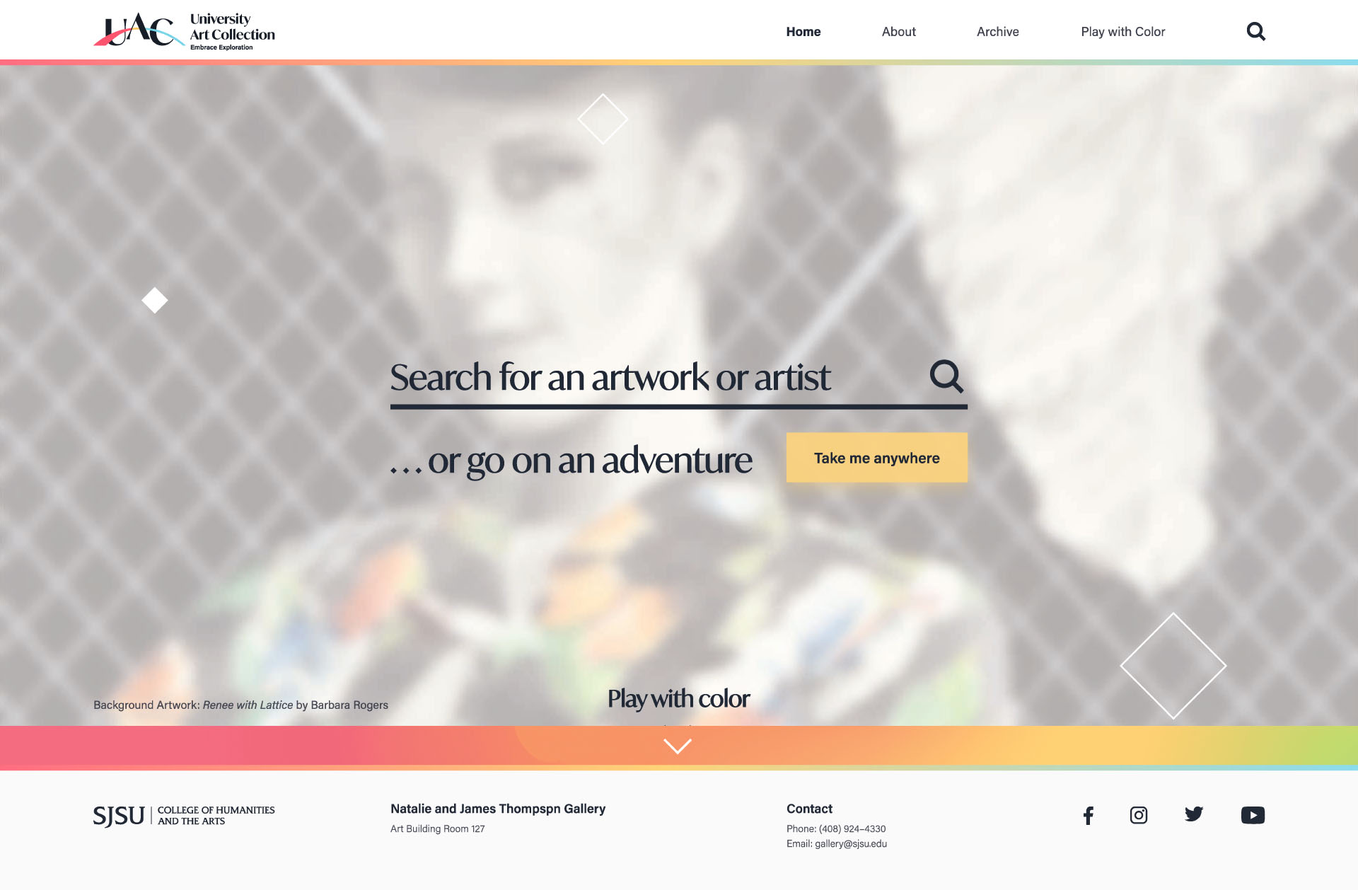
Home
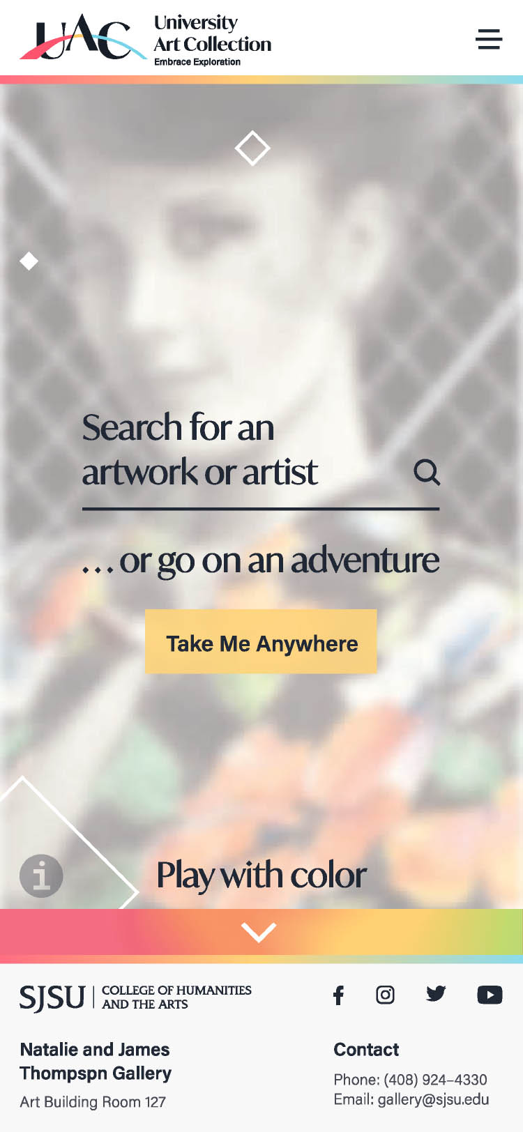
The user is allowed to search for an artwork or artist, go on an adventure, or play with color. The background will change every 20 seconds to a random artwork.
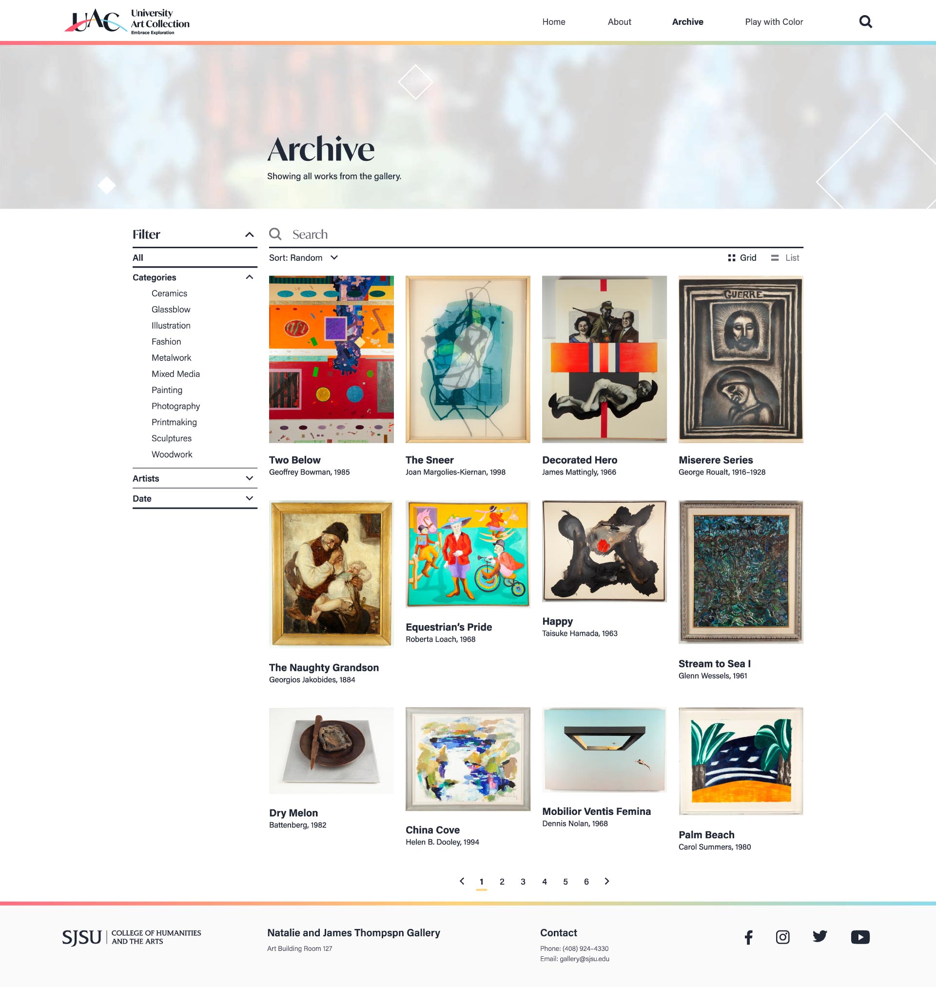
Archive
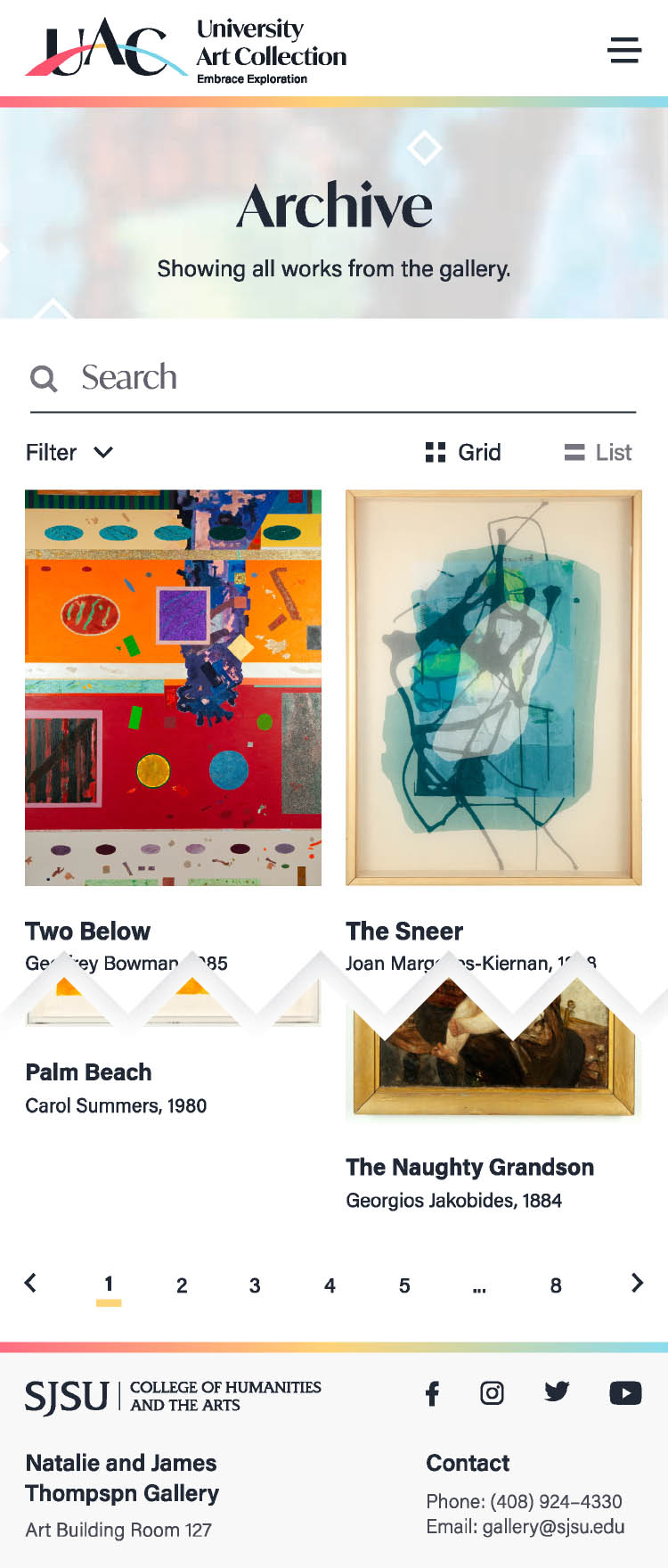
If the user goes to the Archive page from the navbar, they can view all the artwork.
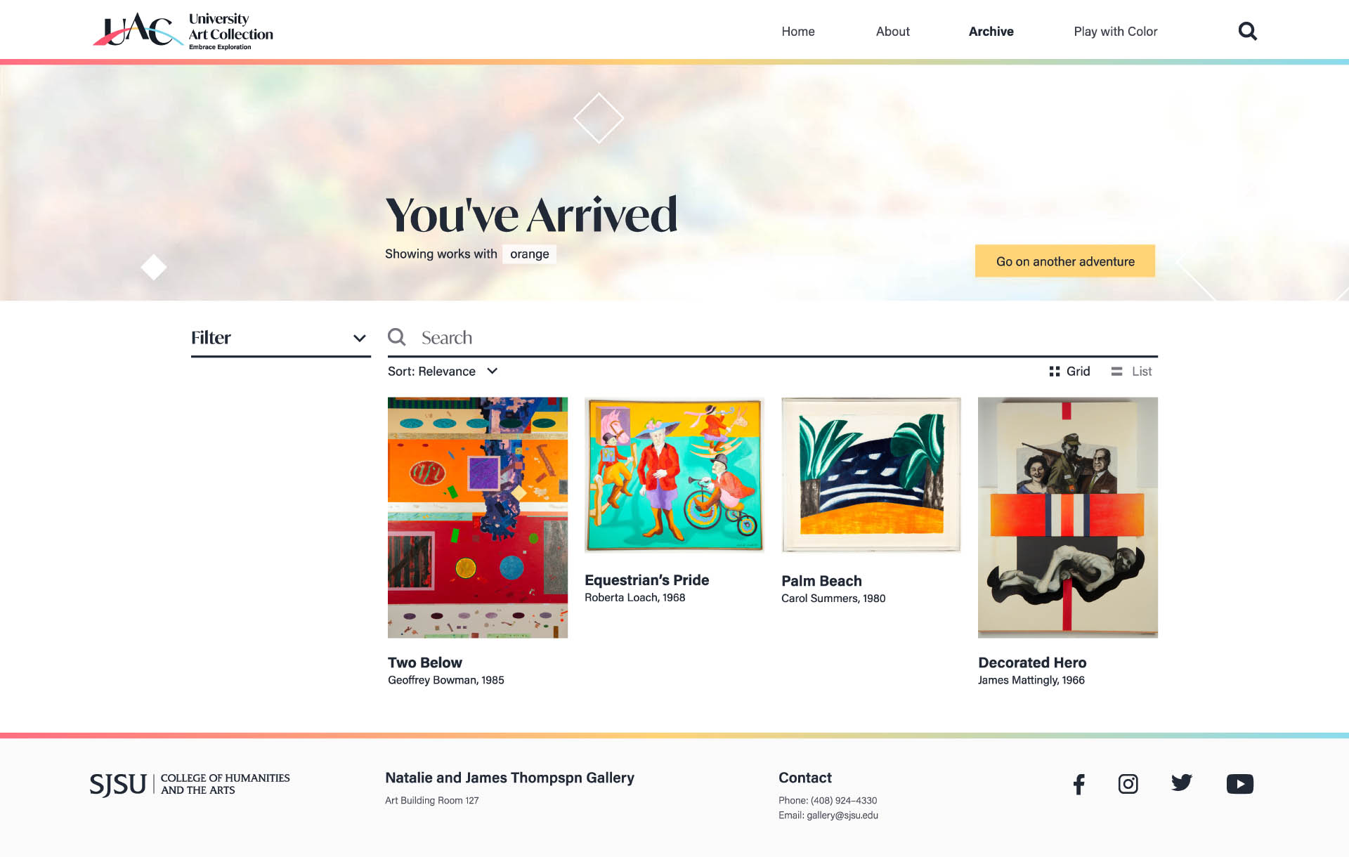
Go on an Adventure
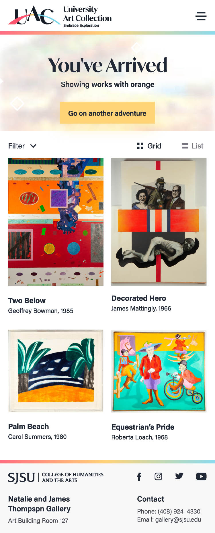
From the homepage, the user can go on an adventure that will take users to a random category or artwork by clicking on the yellow button. The user is allowed to go on another adventure by clicking on the yellow button.
Play with Color
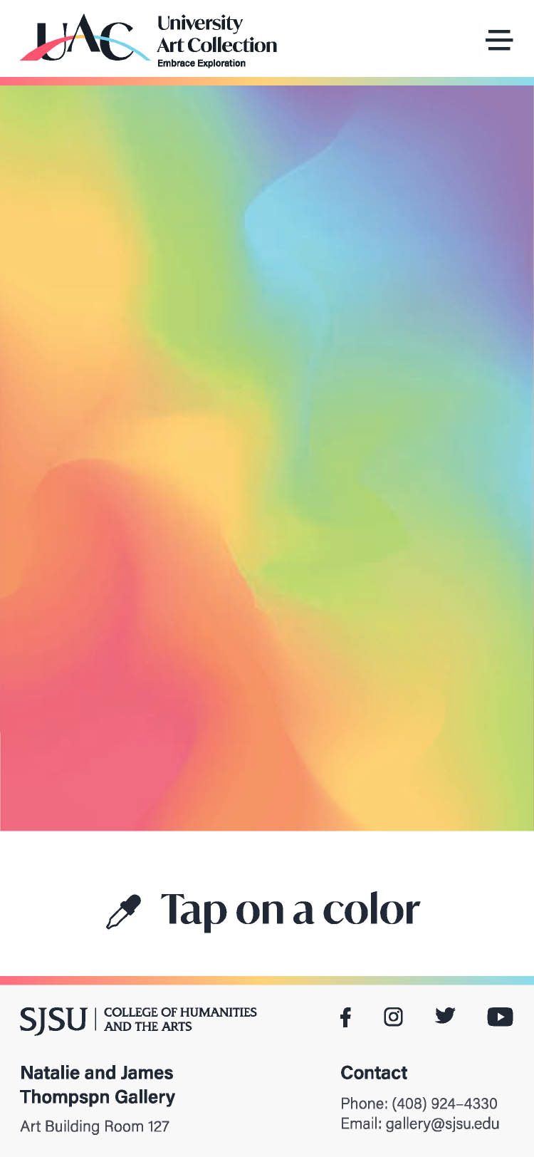
From the homepage or from the navbar under “Play with Color,” the user can select a color and they can see a random artwork closest to that color.
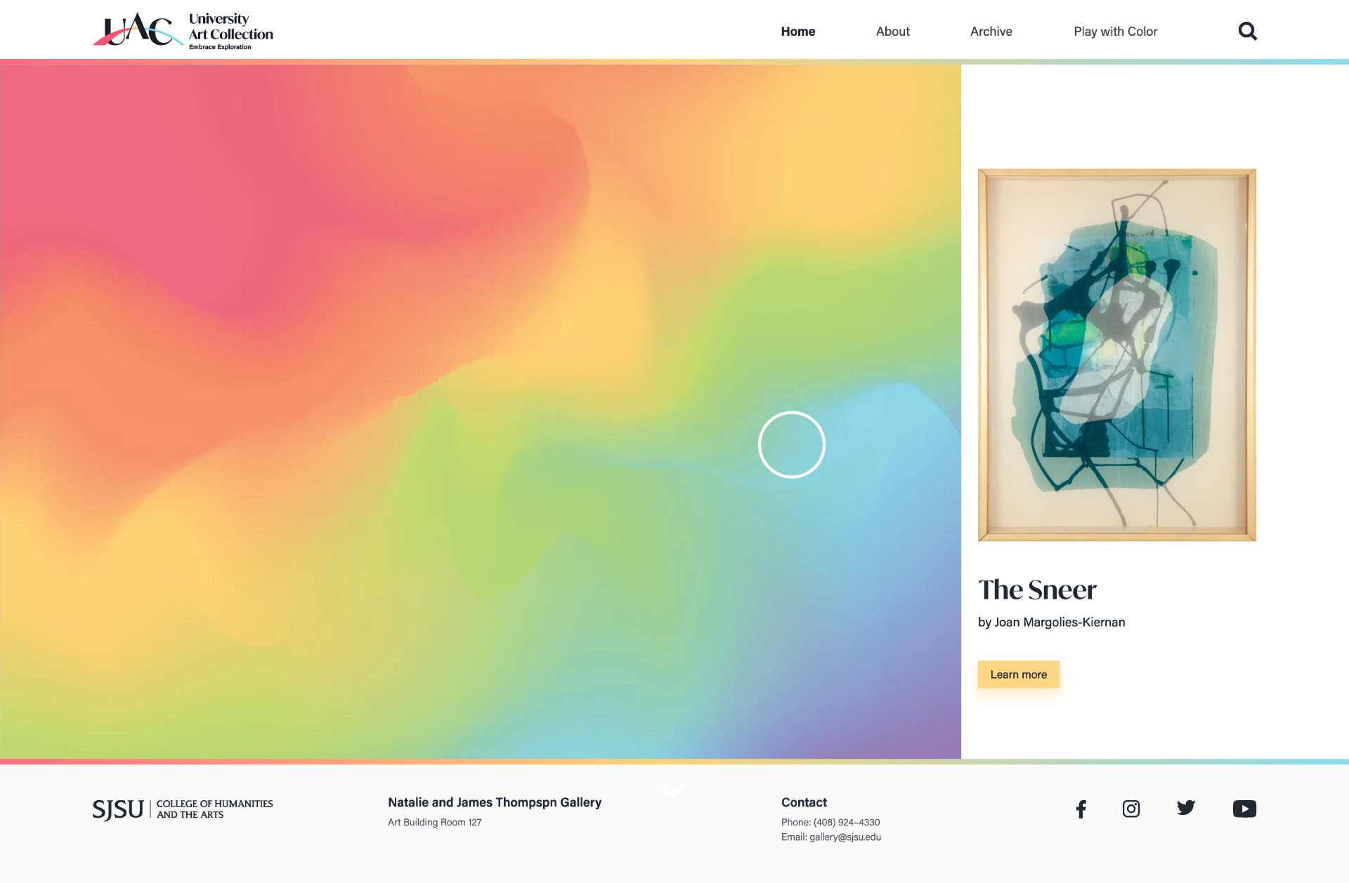
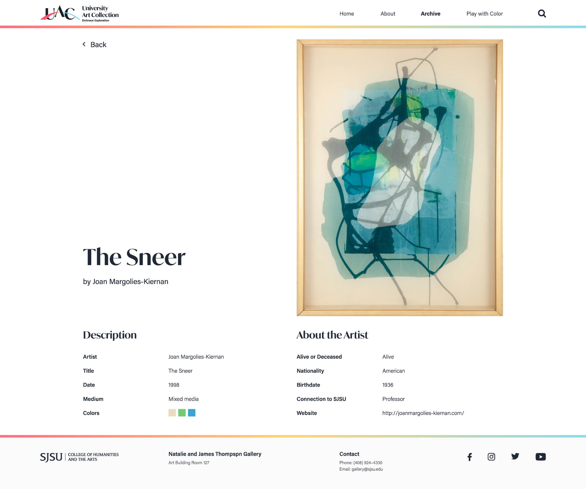
Artwork Description
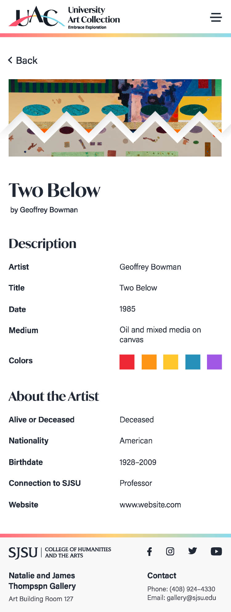
The user can see more information about the artwork and learn more about the artists.
07.
Mobile Screens
Home
Nav/Menu
Archive
Adventure
Play with Color
Play with Color (Selected)
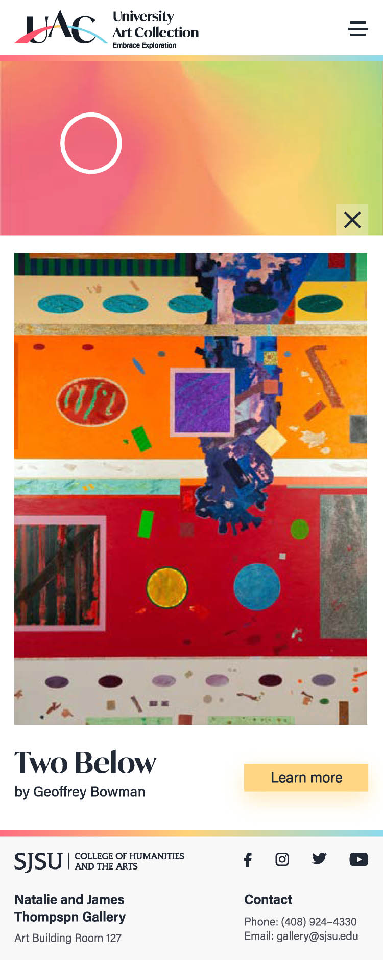
Artwork Description
09.
Interactive Prototype (Mobile Website)
Gift Shop Item
Hidden
10.
Zip Pouch
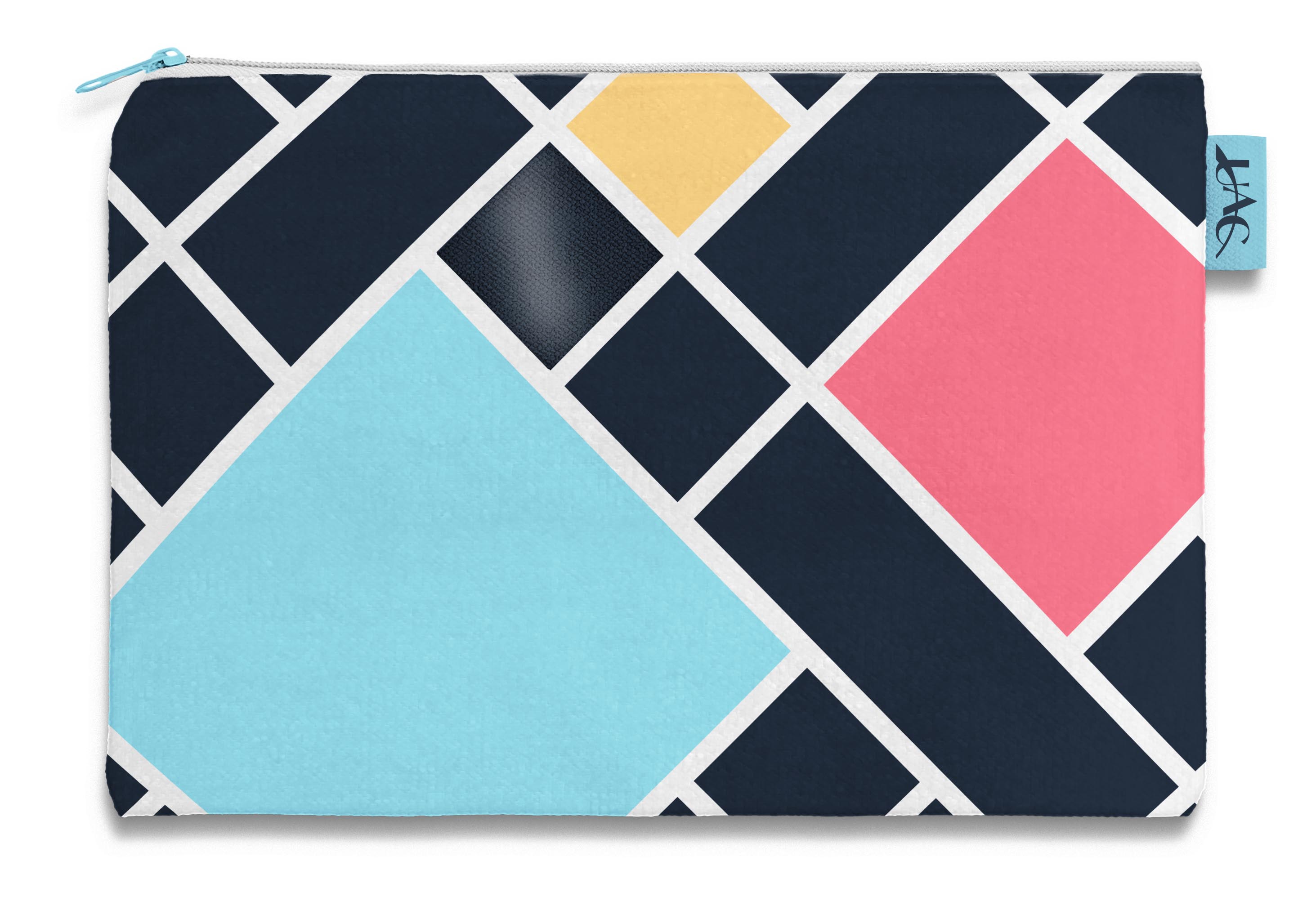
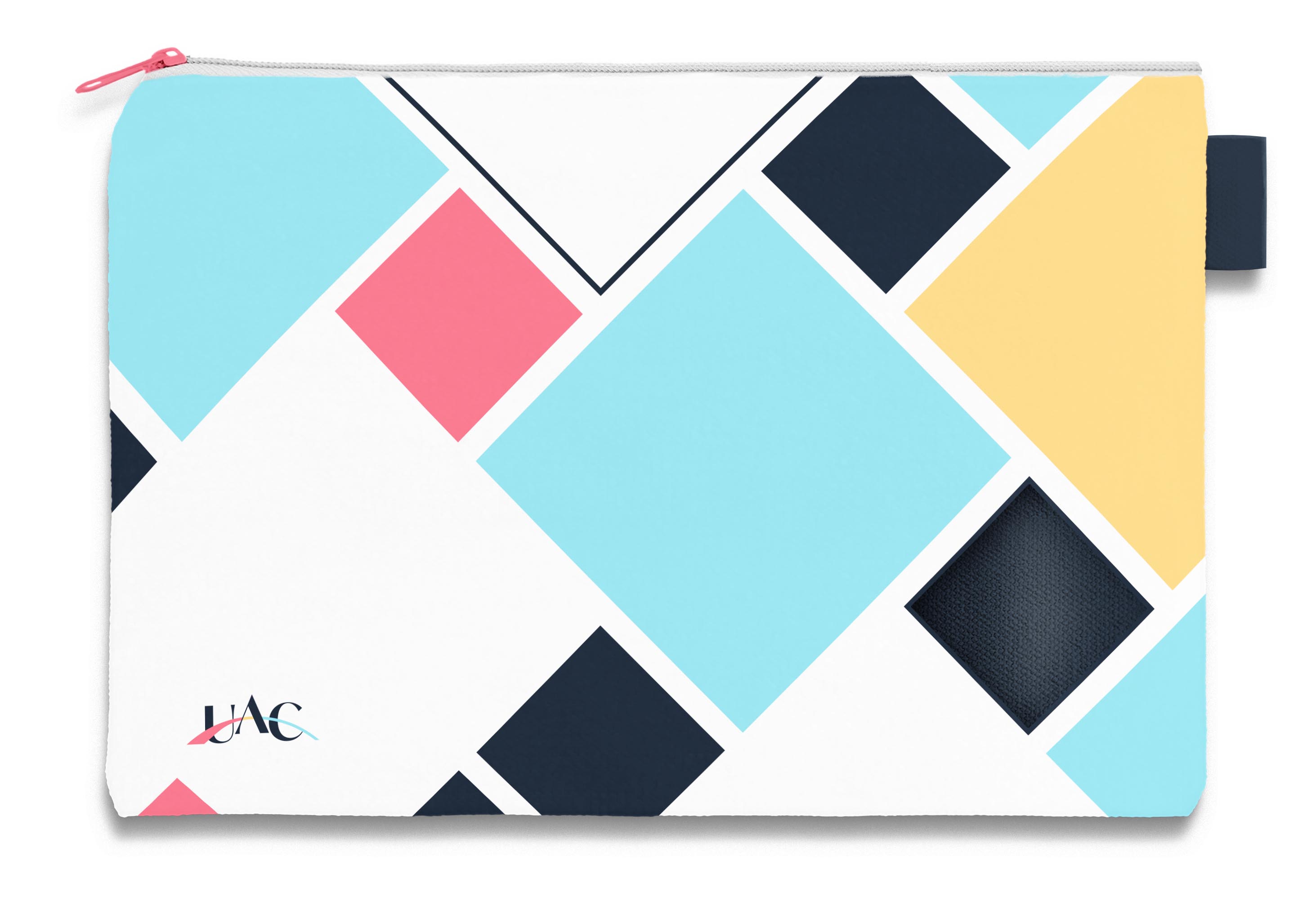
Our tagline “Embrace Exploration” can relate to the idea of mystery. An item that relates to mystery would be a bag. We don’t know what’s inside the bag or you may know but someone else probably won’t. We chose a zip pouch because most of our audience is into art and/or is a student.
Materials
Plastic because it is cheap, easy to print on, and it can be translucent.
Colors
Only use the four main colors of our brand.
Clear Diamond
On every design, there is one translucent diamond.
Tab on the Side
Users can put a pen or pencil through the tab and have the tab hold it.
More Projects
