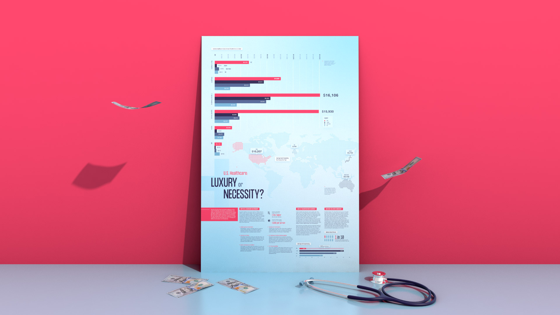
U.S. Healthcare: Luxury or Necessity?
Infographic
Motion Graphics
3D Build
Software
- Adobe Illustrator
- Adobe Photoshop
- Adobe After Effects
- Cinema 4D
Deliverables
- 24" x 36" Infographic Poster
- 3D Physical Build
- Video Animation
Timeline
- August–October 2021
- February–March 2022
Objective
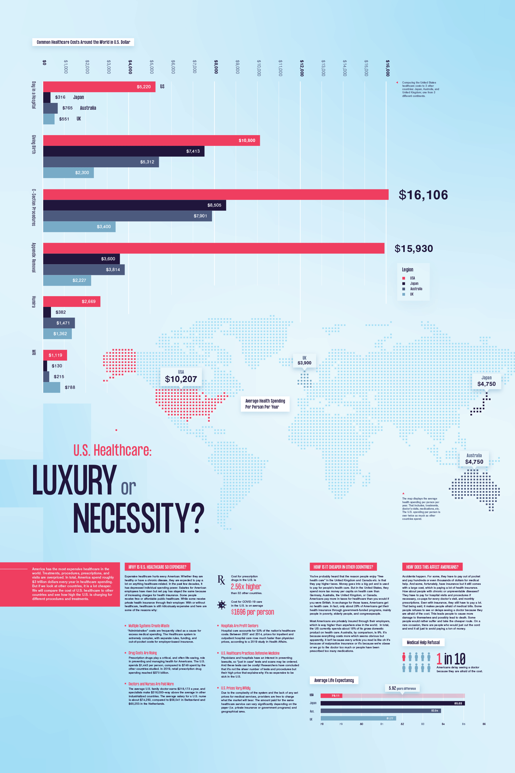
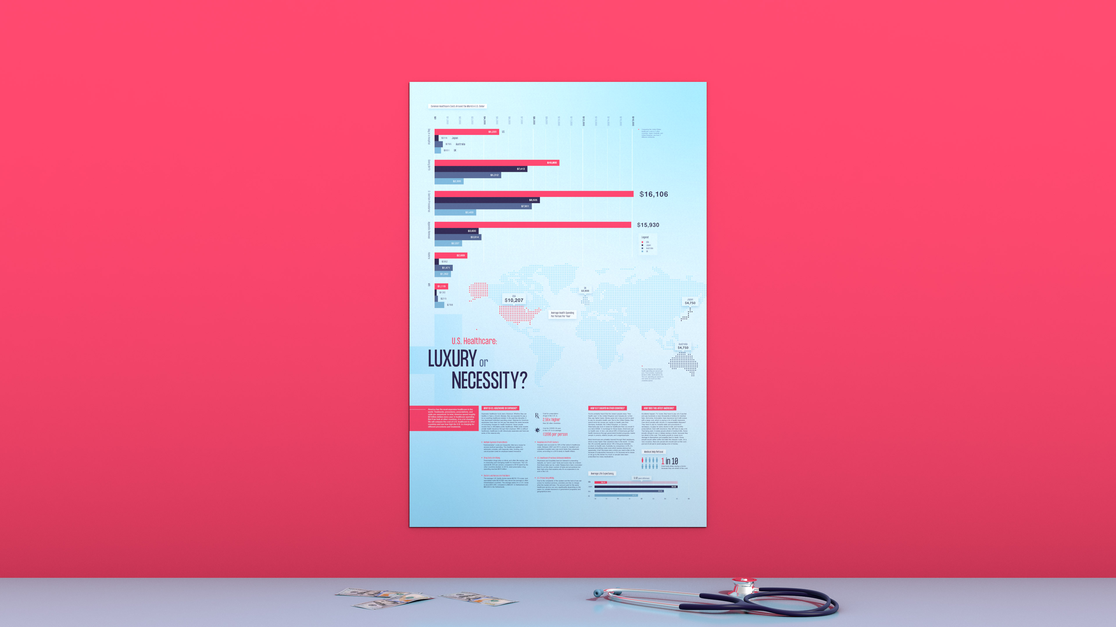
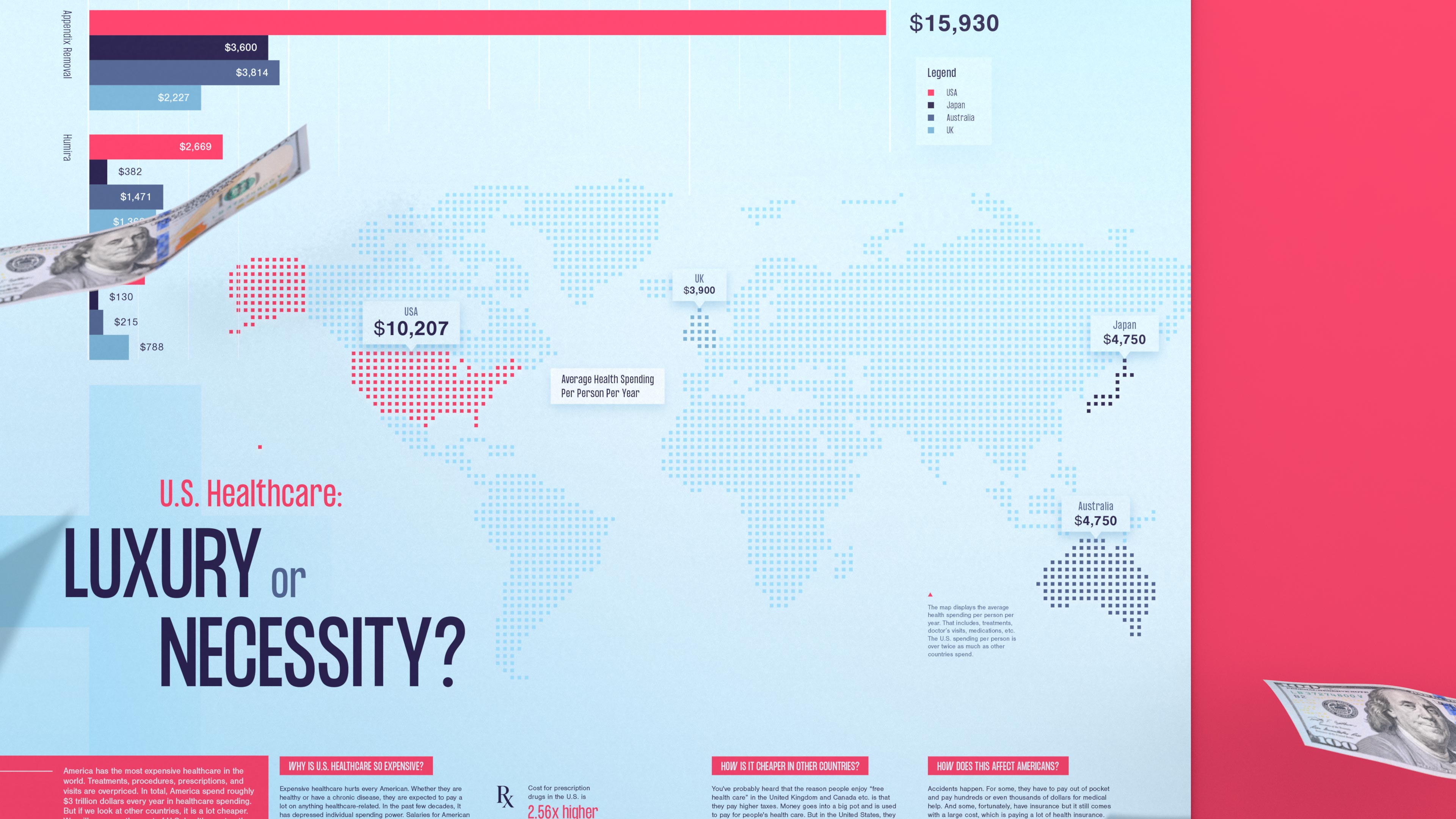
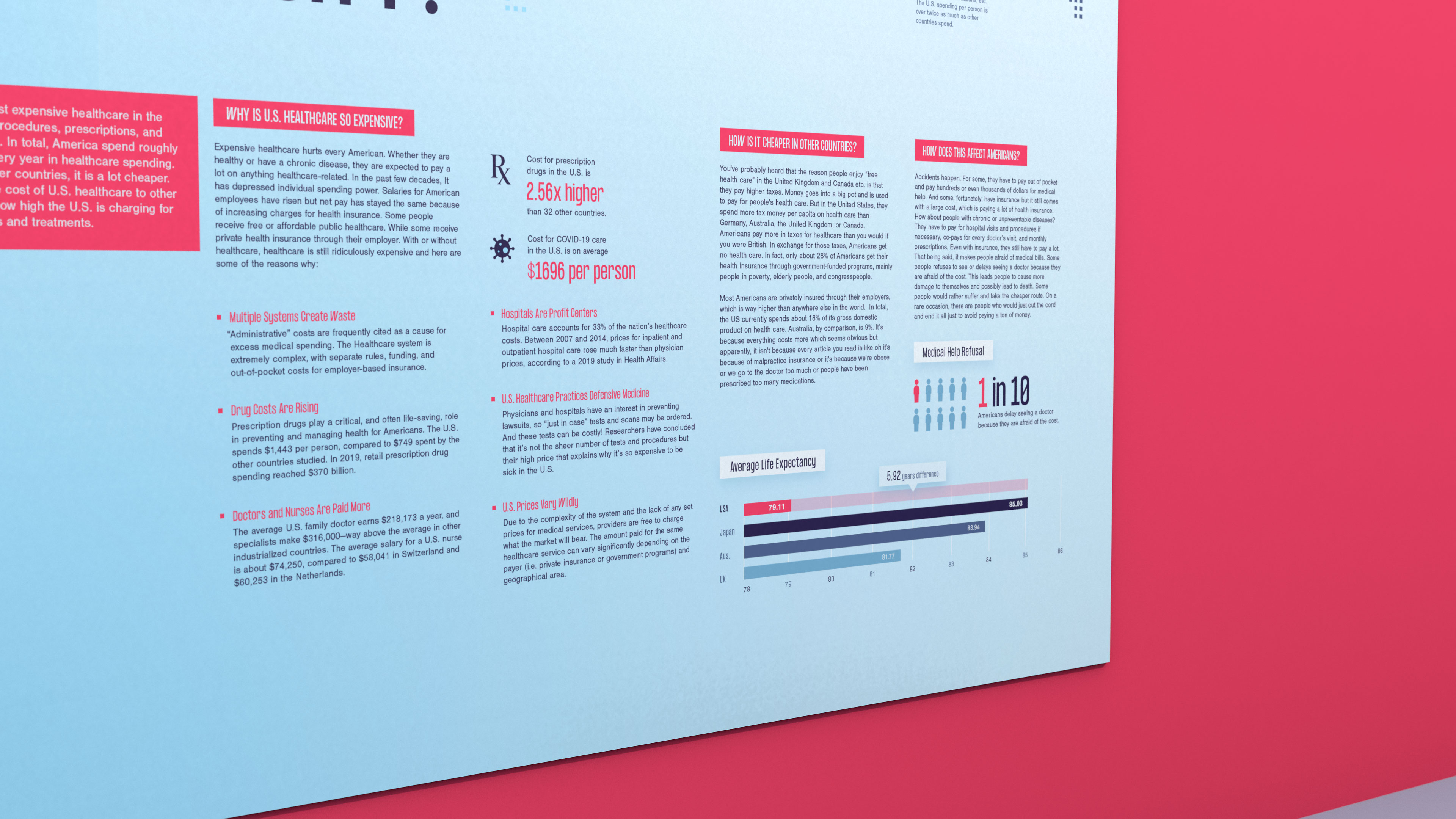
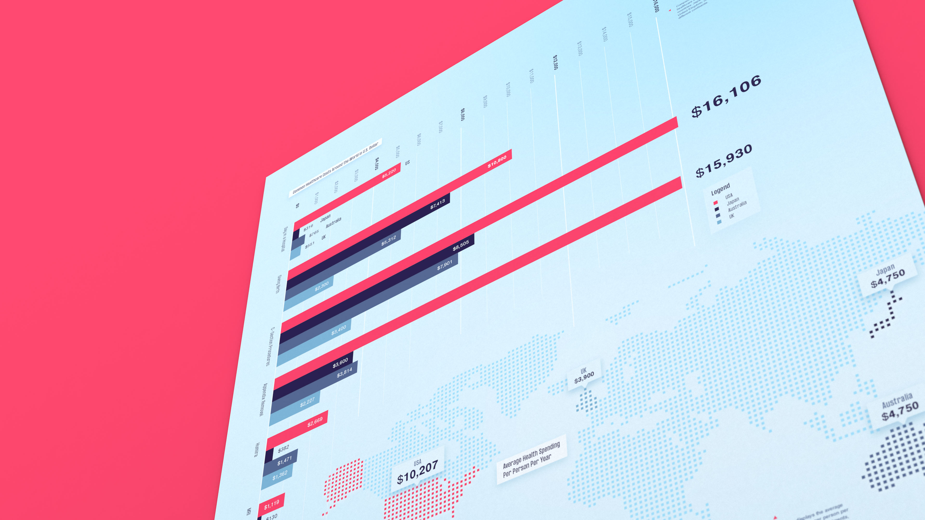
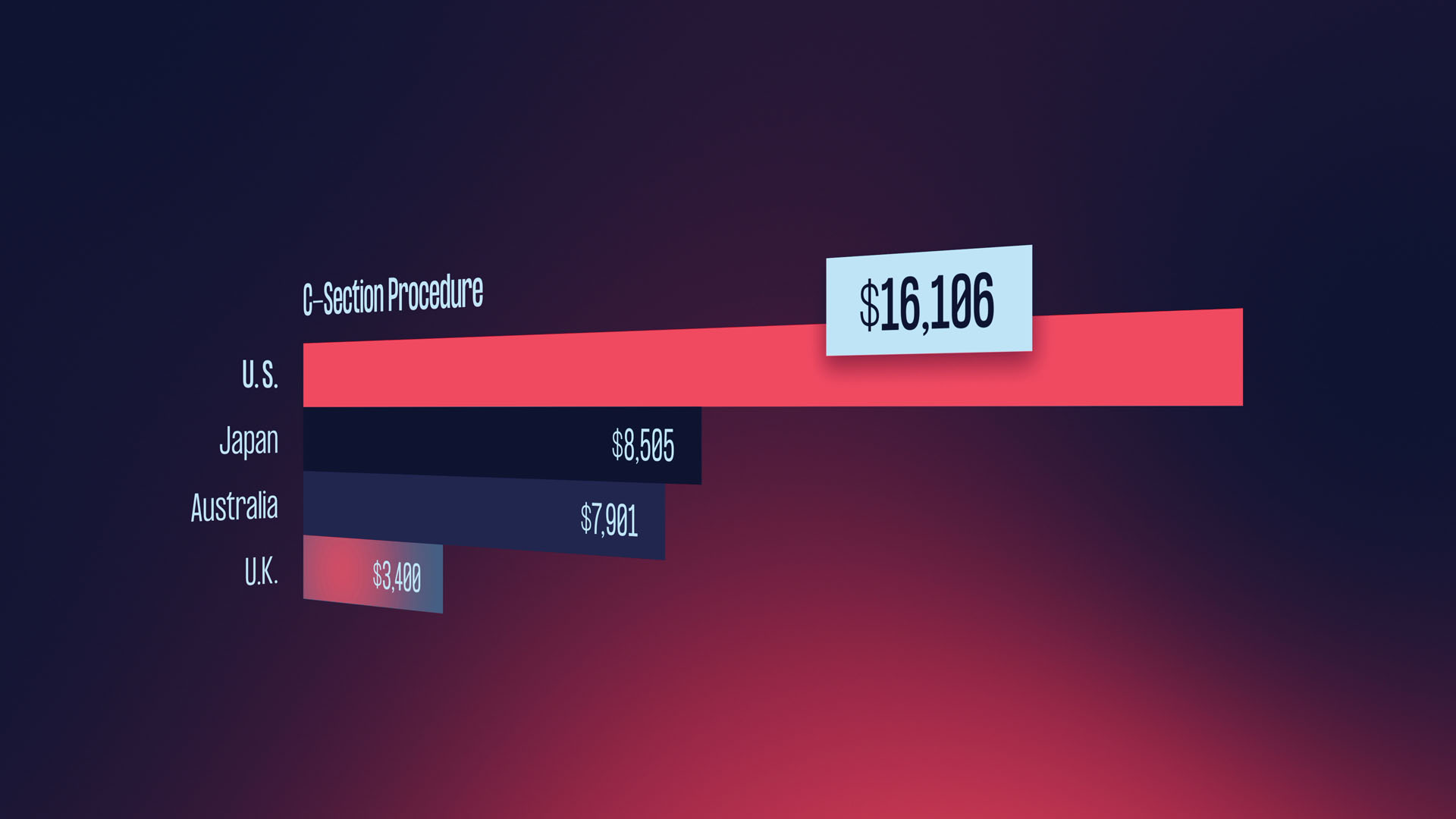
By using three different design approaches: infographic poster, 3D infographic, and video infographic; I want to showcase how healthcare in the United States is much more expensive compared to these three major countries: Australia, Japan, and the United Kingdom.
Problem Statement
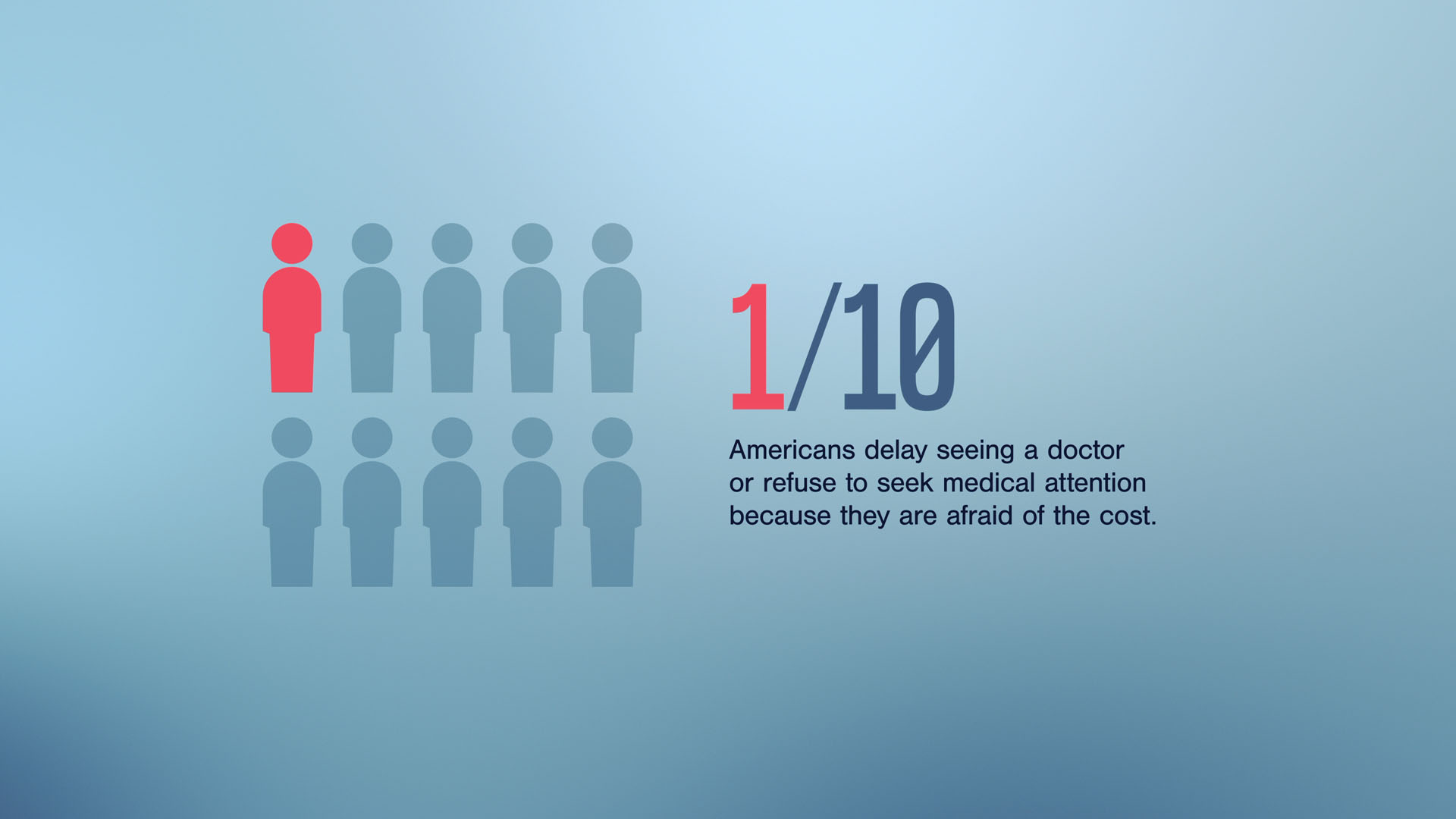
Healthcare in the United States is a big issue because it is very expensive. The United States spends around three to four trillion dollars on healthcare every year. Some people are taking risks or cutting their lives short to avoid paying or they cannot simply afford it.
Infographic Poster
Click to showHidden
01.
Research
Before I start designing, I research the many aspects of healthcare, such as common surgeries and procedures, medication prices, and hospital visits. There were a lot of pain points because this is a big topic in the United States. But at the same time, I had to make sure that I can find the same data and information for Australia, Japan, and the United Kingdom. I watched a lot of YouTube videos, articles, and public data.
02.
Initial Designs
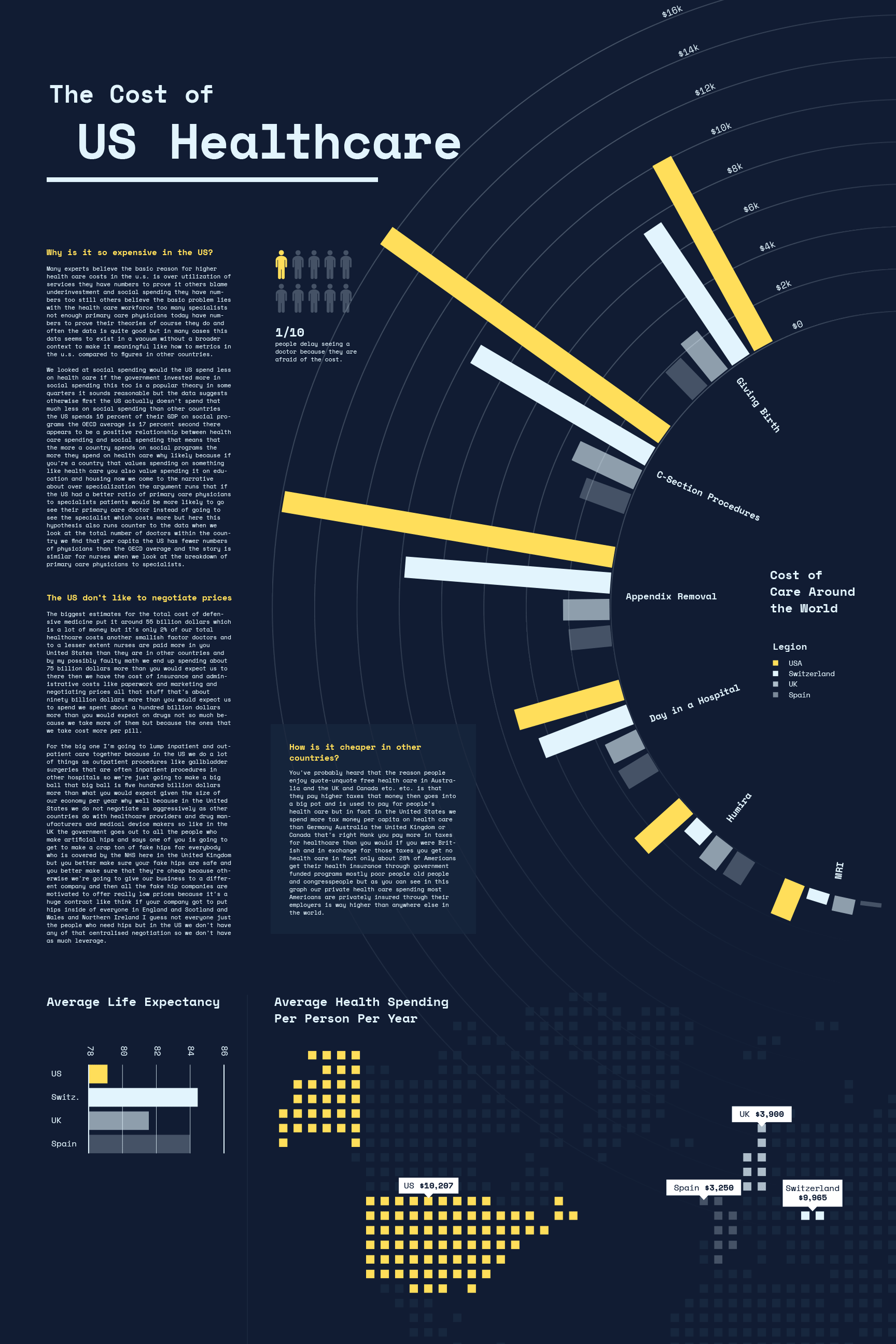
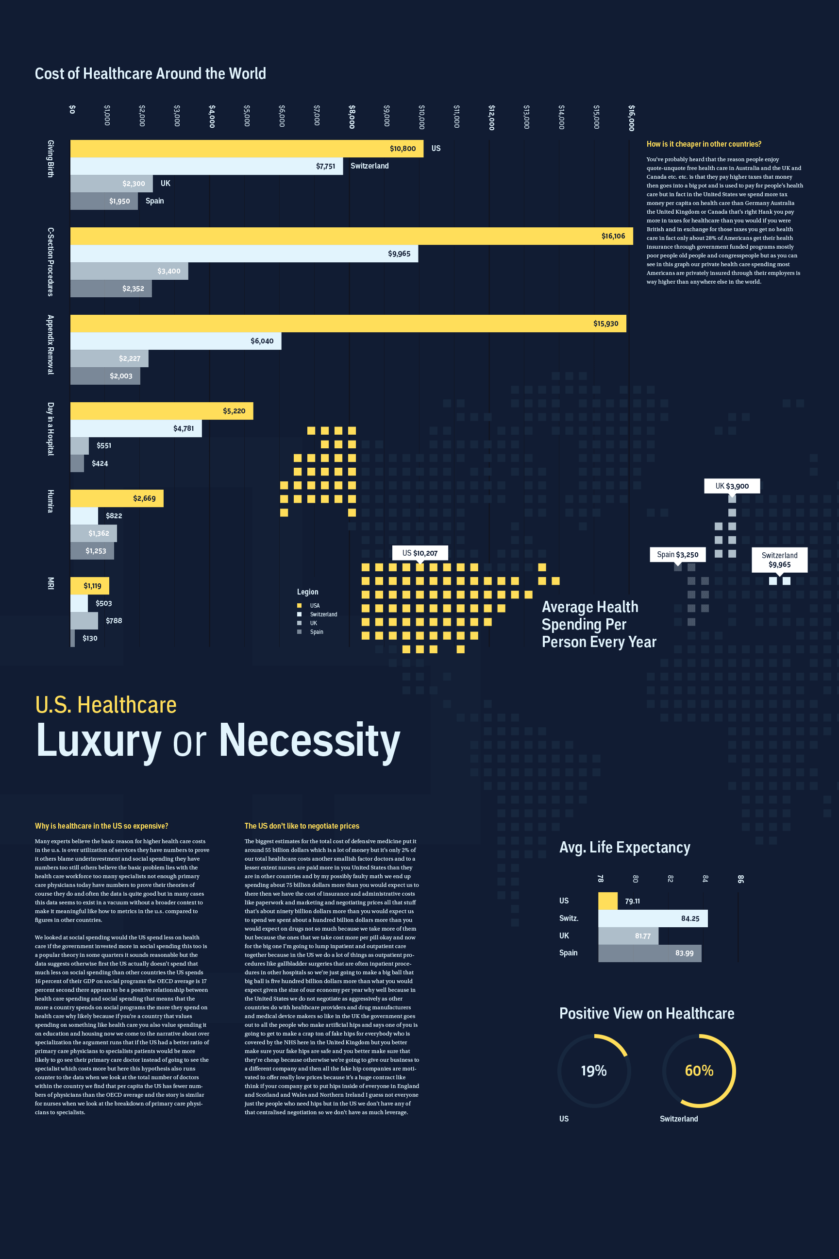
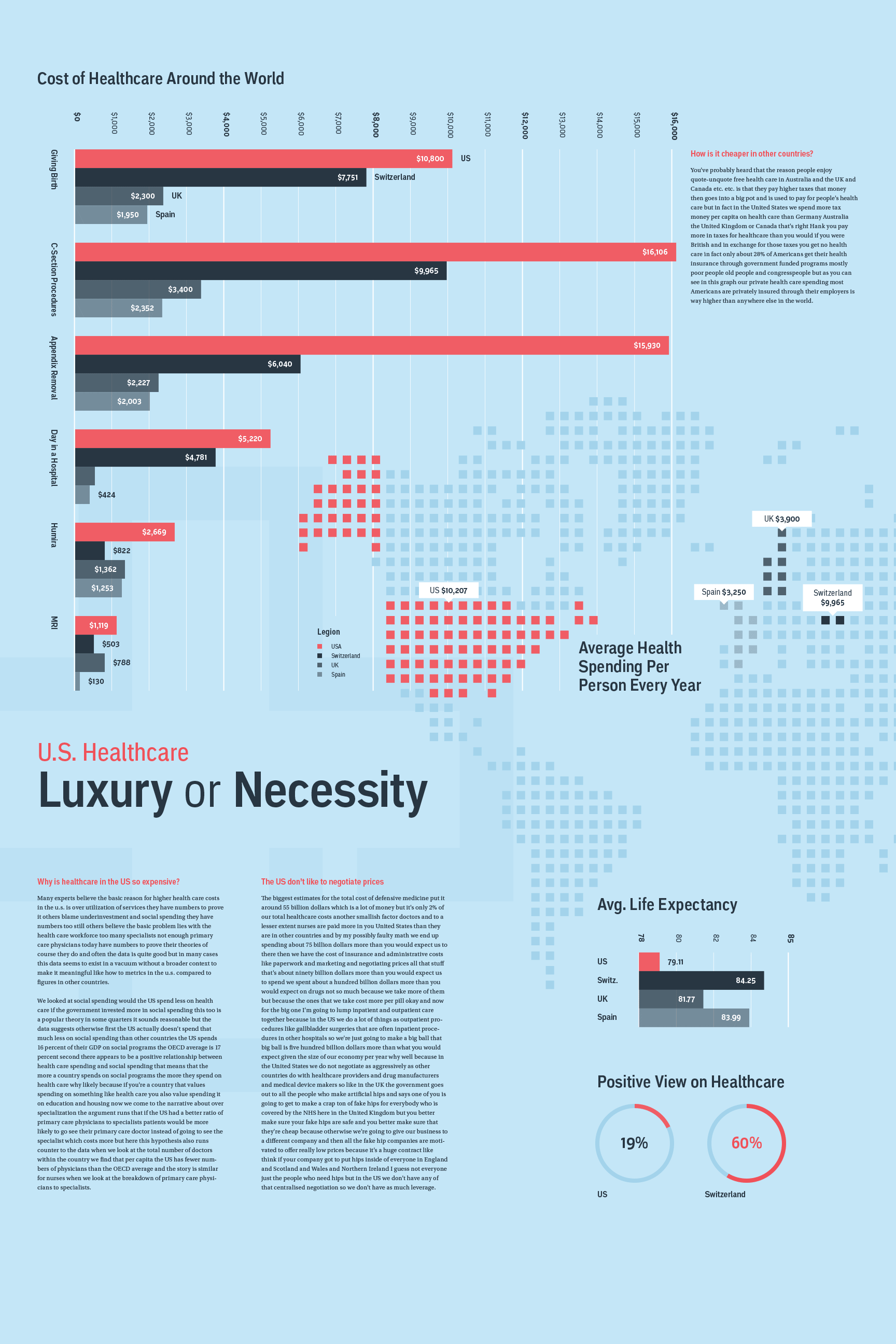
After collecting my information, I created a few thumbnail sketches and then converted them to low-fidelity wireframes. After that, I started to design in Illustrator by adding color, choosing the typefaces, and creating the graphics.
03.
Final Design
After getting feedback, I learned that the color scheme for the first two designs doesn’t relate to healthcare. And the monospace font on the first design doesn’t relate to healthcare either. In the the third design, the light blue and red scream healthcare. So, I went ahead and add more information, improved the graphs and graphics, tweak the color scheme, and fix the typography.
3D Infographic Build
Hidden
05.
Model Idea
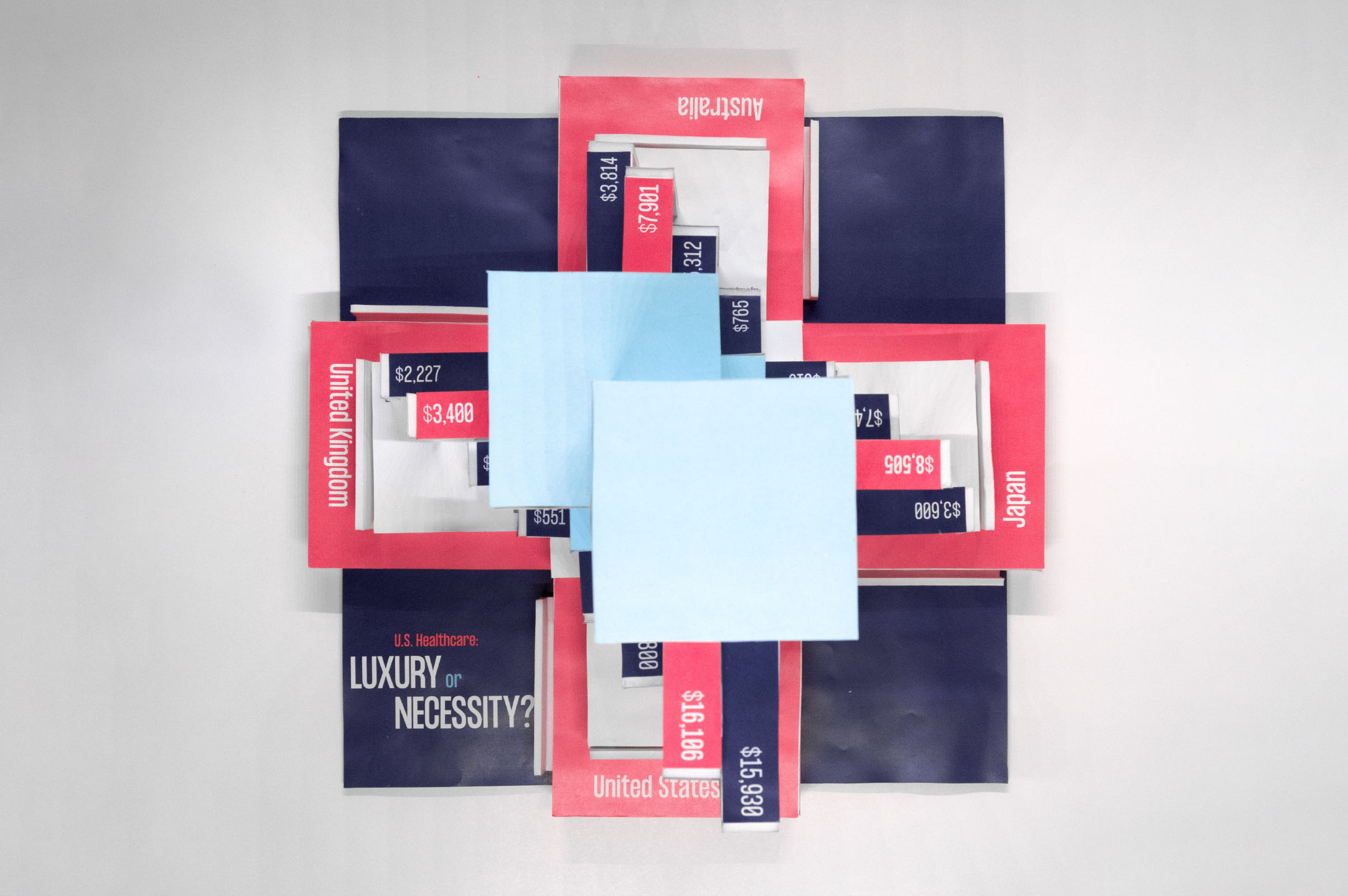
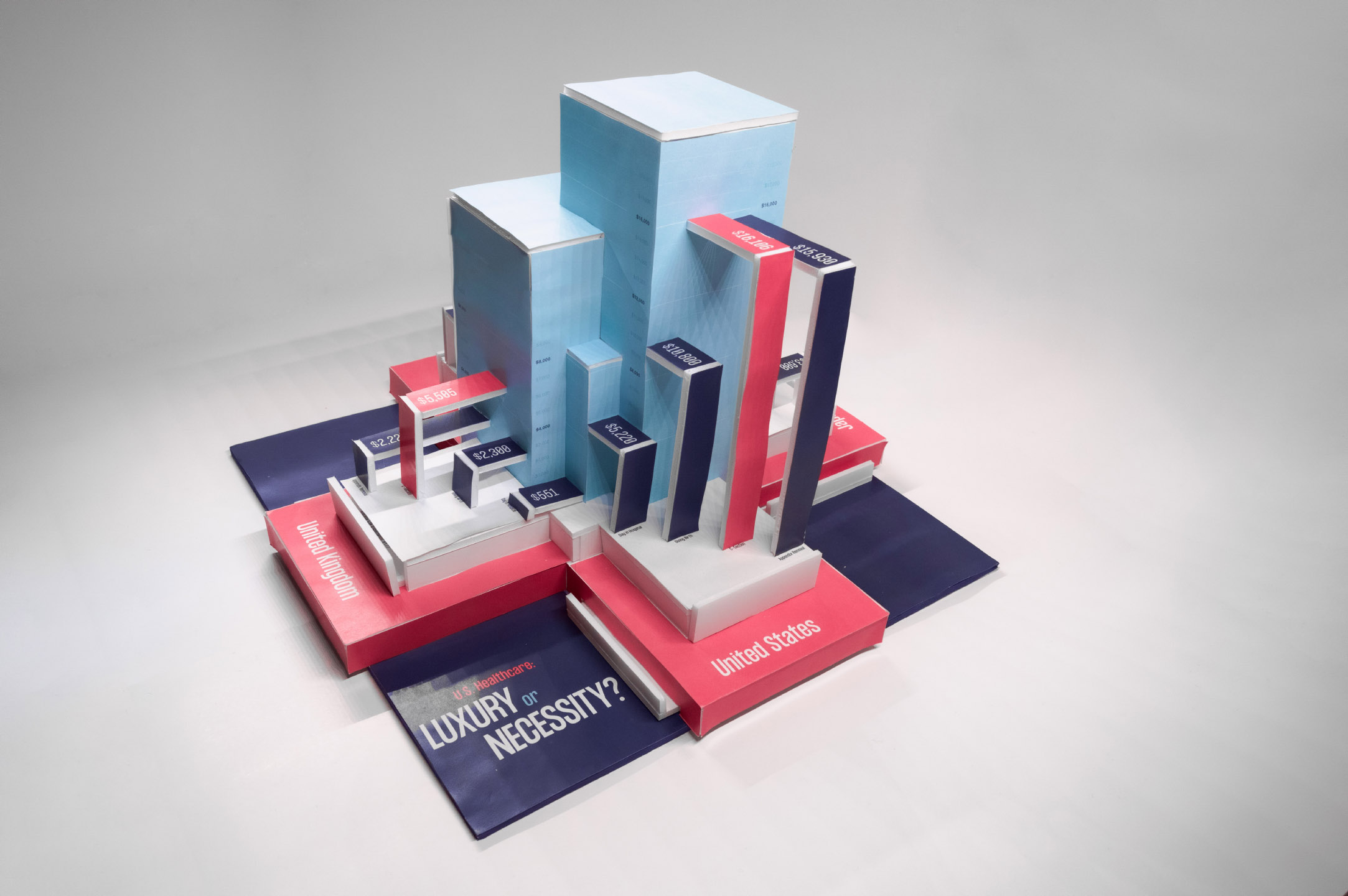
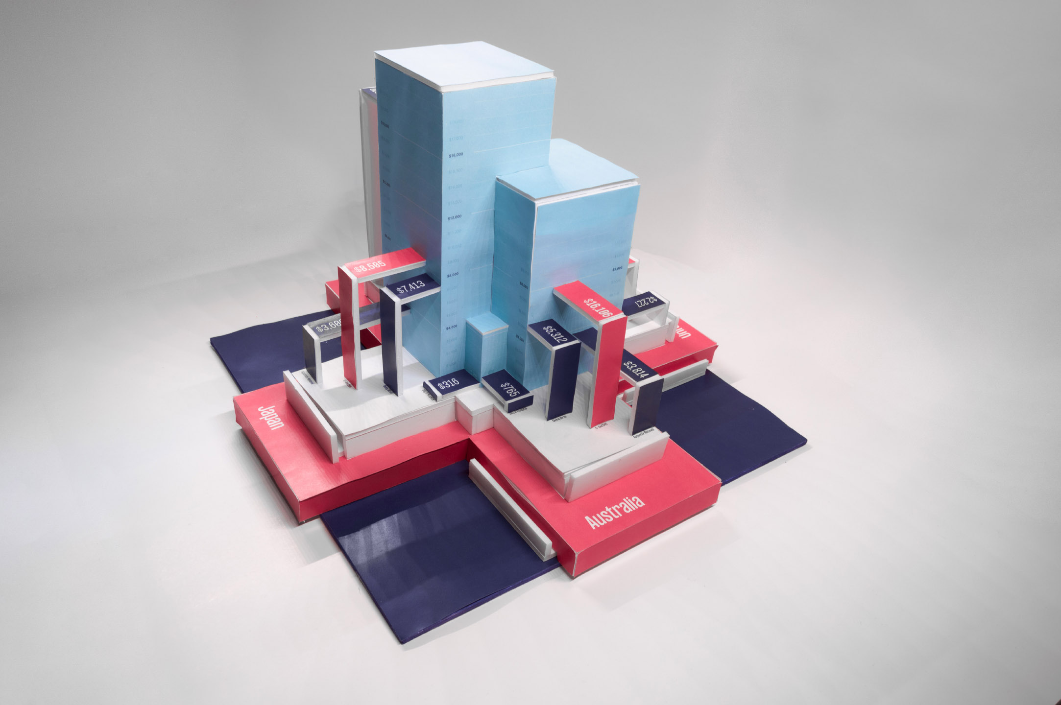
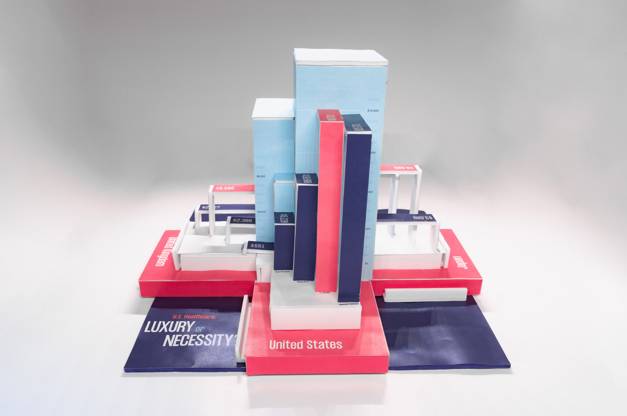
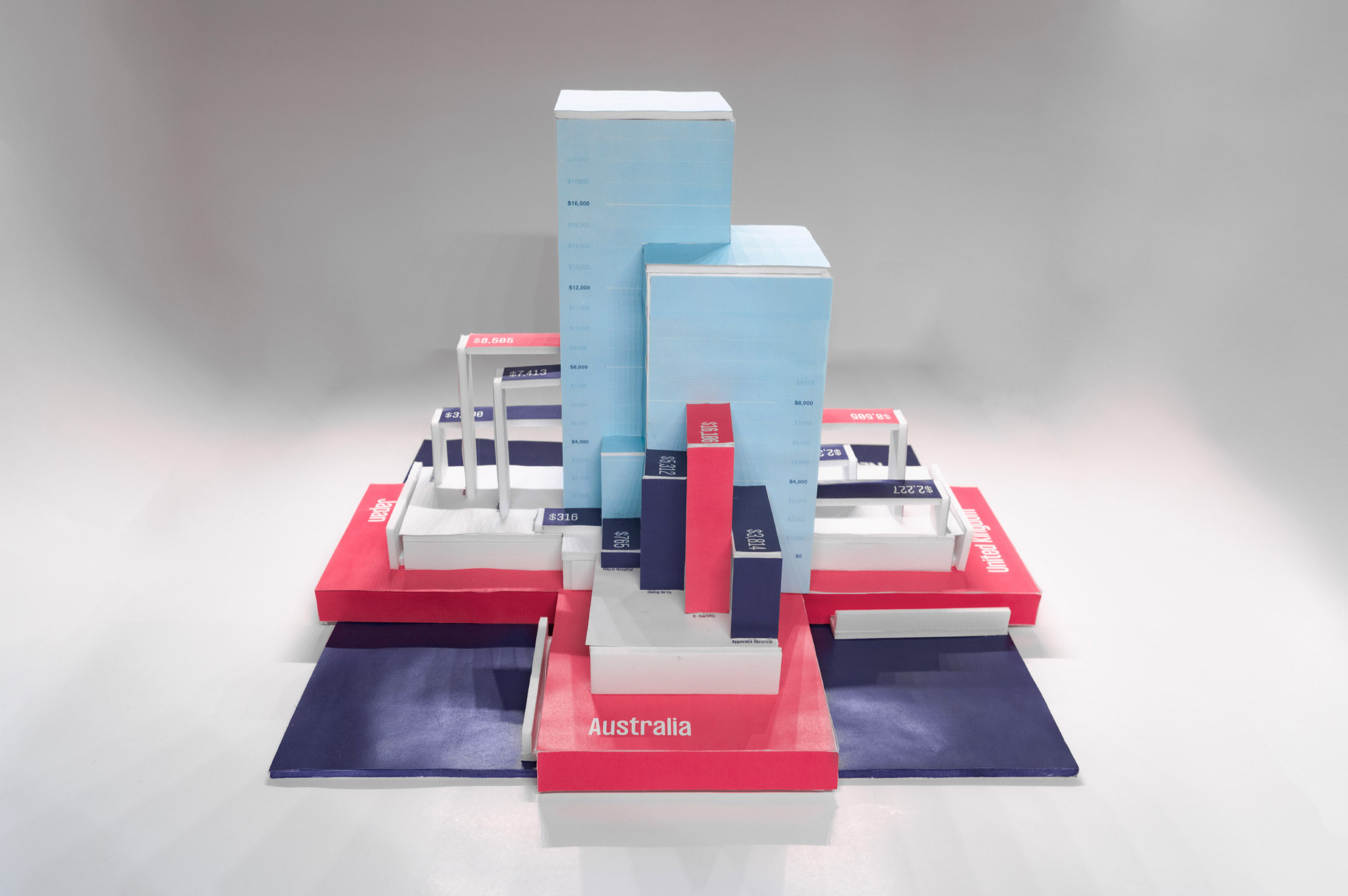
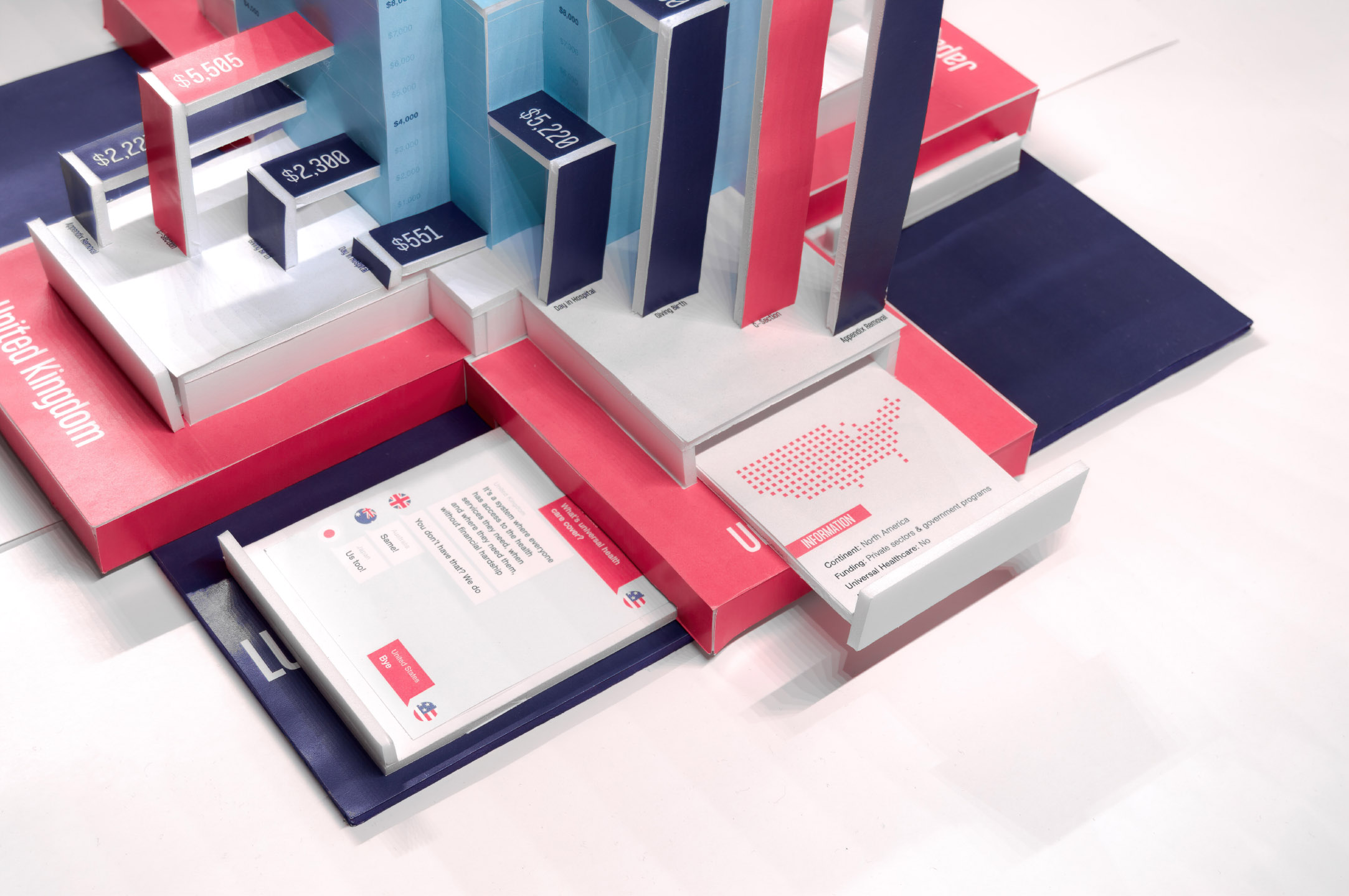
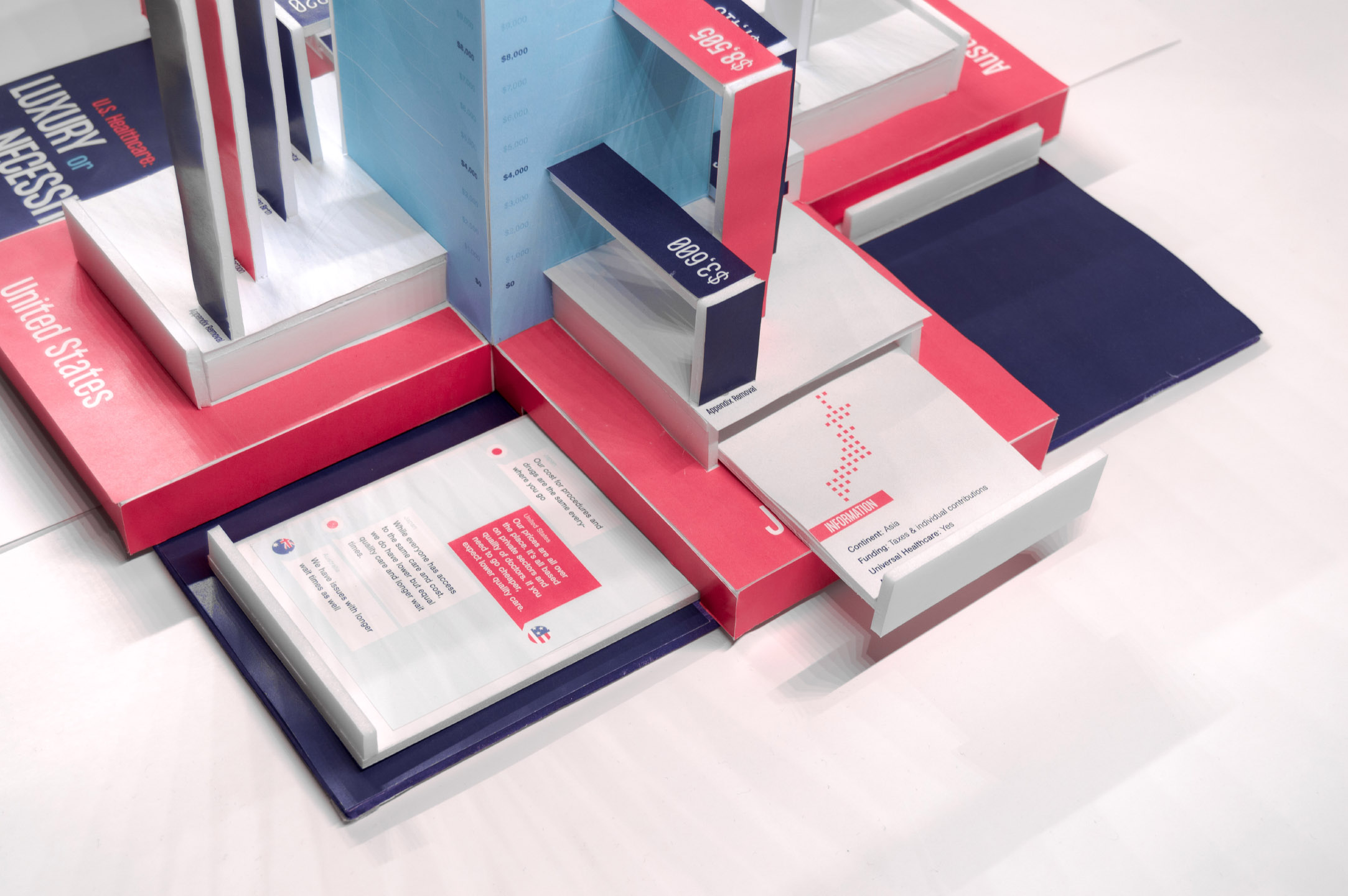
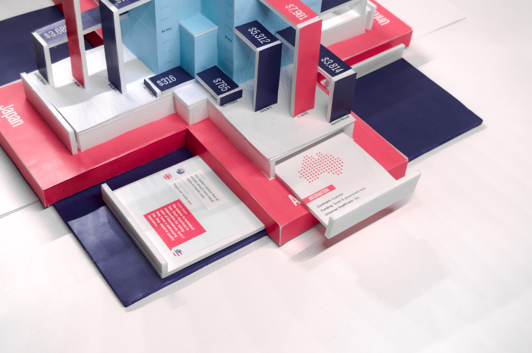
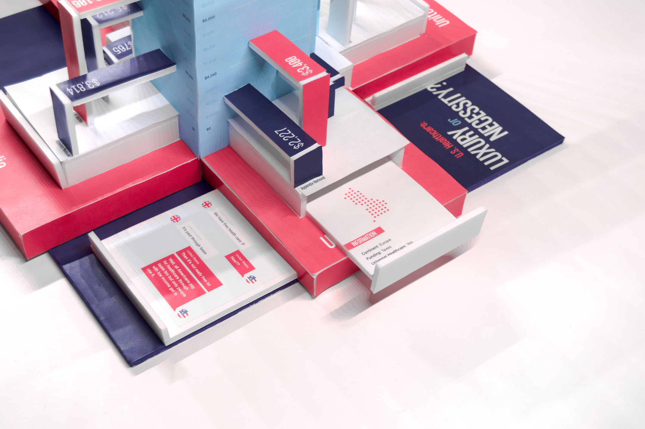
After experimenting with different paper folds, I concluded that the base of my 3D build should resemble a cross or a medical symbol and each point should be one country. I wanted to extrude the bar graph from the poster, emphasizing the healthcare cost in the United States using the bright red color. I wanted to have hidden compartments to reveal more information about the countries, as well as conversations between the countries about their healthcare. The hidden compartment was inspired by the hidden fees the United States has in healthcare.
06.
Initial Design
I first designed my model in Cinema 4D to experiment with different forms and create accurate measurements before I execute them physically.
Video Animation
Hidden
08.
About
I wanted to condense my infographic poster and turn it into a video animation where the content is easy to digest. I wrote the script and had a friend narrate. I copied the color grade and visual style from the infographic as much as possible.
09.
Specifications
Resolution: 3840 x 2160px (4K, 2160p)
Frame Rate: 29.97fps (30fps)
Duration: 1m 55s
Narrator: Marquis L.
Frame Rate: 29.97fps (30fps)
Duration: 1m 55s
Narrator: Marquis L.
11.
Final Video
